Designing for Premature Closure of FDs
Product Design
What If Closing Your FD Wasn't the Only Option? We Made Sure Users Knew

Context
The PM's original ask was straightforward: build a comparison screen showing users how much interest they'd earned so far on their FD vs. how much they'd have earned by holding it to maturity — shown when a user tries to close their FD early.
While scoping this, I saw an opportunity to expand it. Premature FD closure isn't just a UX moment — it's a revenue/interest loss for the business every time it happens. But more importantly from a user's side: many people close an FD simply because they need liquidity, without realizing that closing it entirely isn't their only option. A comparison table alone would show them the cost, but wouldn't tell them anything about the choices available to them. So I proposed going a step further: before showing the comparison, surface the information and alternatives a user would need to make a fully informed decision — options they may not have known existed.
I validated this direction with the PM and stakeholders before building it out.
Role: Expanded a PM-defined ask into a fuller flow — proposed and designed the additional decision-support step myself.
Problem
Users closing FDs early lose out on interest — but many of them are doing so simply to access funds, without realizing alternatives exist that don't require breaking the deposit at all. For the business, this also means every closure driven by a liquidity need (rather than a genuine intent to exit the FD) is a preventable loss, if the user had simply known their options.
Constraints
Original scope from PM was narrow (just a comparison table) — had to build a case for expanding it, not just design past the brief unilaterally.
Validation was limited to PM/stakeholders, not end users, given project timelines.
Process
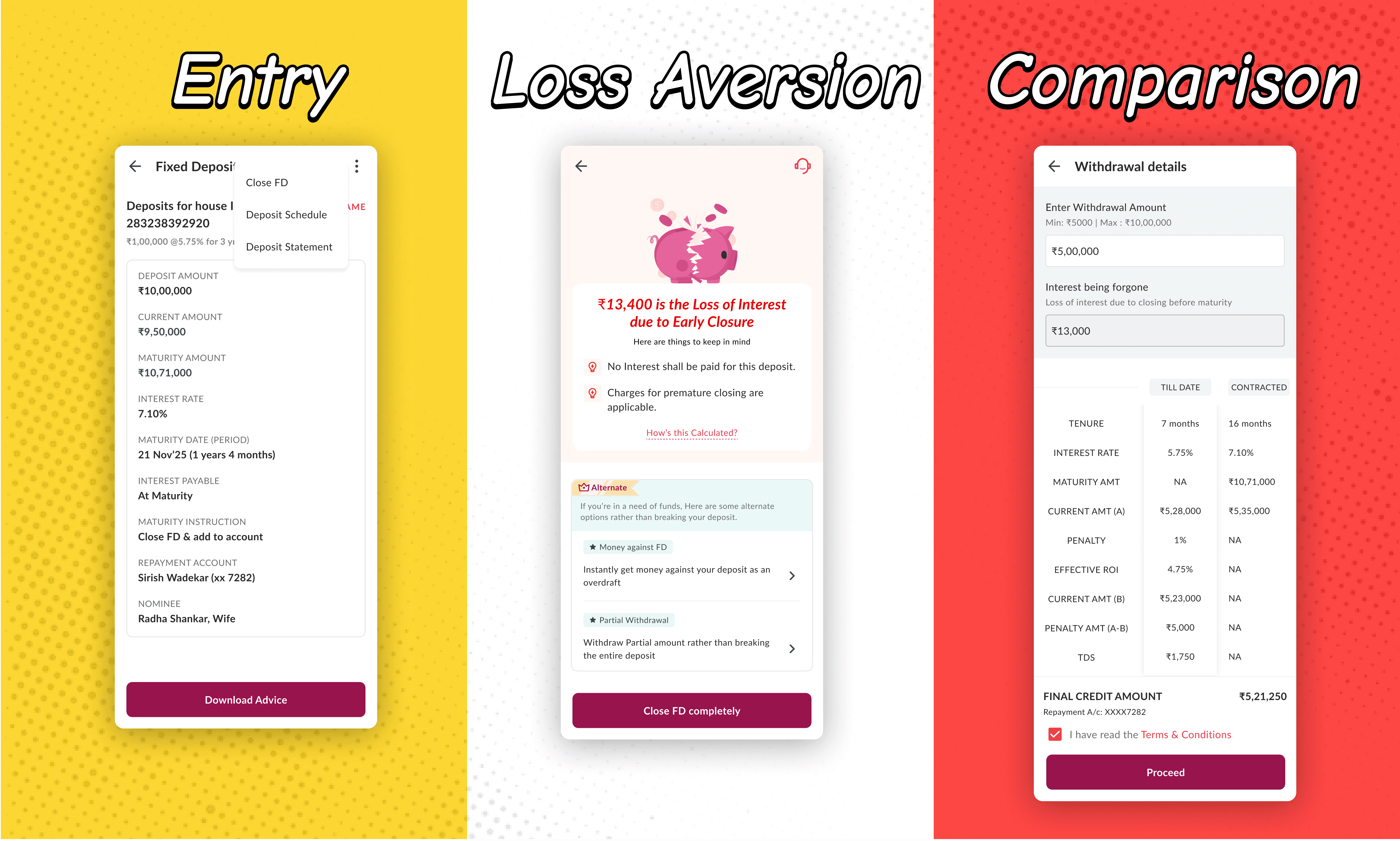
Screen 1 — FD Details Full transparency on the deposit before any closure action — deposit amount, current amount, maturity amount, interest rate, tenure, nominee. Ensures the "loss" framing on the next screen isn't dropped on the user cold.
Screen 2 — The interim intervention screen (core of this case study) Triggered the moment a user taps "Close FD." Structured in two deliberate parts:
The full cost, stated clearly, first — "₹13,400 loss of interest," shown big and bold, with two supporting facts (no interest paid, charges apply). This isn't framed to discourage the user — it's information they're entitled to before making a financial decision, and it needs to be seen before anything else so it isn't missed or glossed over. (Unlike earlier where they used to find about interest or charges after the FD had been closed)
Alternatives, second — "Money against FD" (instant overdraft against deposit) and "Partial Withdrawal" (withdraw partial amount instead of breaking the FD), each framed around the user's actual need (liquidity), not product mechanics. These exist specifically for users who assumed "close the FD" was their only option to get funds — surfacing them here means the user finds out before they act, not after.
"Close FD completely" remains visible and functional at the bottom — the decision always stays with the user. The goal was to inform, not to steer.
Screen 3 — Withdrawal/Comparison details The PM's originally proposed table, now showing full particulars (contracted vs. till-date): tenure, interest rate, maturity amount, current amount, penalty, effective interest rate, and final "Interest being foregone" (₹13,500) before the user proceeds. This number stays consistent with the ₹13,400 shown on the previous screen — reinforcing trust through consistent messaging across the flow.
Key Decisions & Trade-offs
1. Expanding beyond the brief Took a "just build a table" ask and turned it into a fuller flow, because a table alone would tell users the cost of closing early, but not that they had other options — the real gap wasn't information about loss, it was awareness of alternatives.
2. Sequencing information before alternatives Showed the full cost of closing early before the alternatives, so users see the complete picture first — not to discourage them, but so the alternatives that follow are genuinely useful context, not a distraction from something they weren't told.
3. Keeping the "close anyway" path fully visible and functional The decision was always left with the user — closing the FD remained one tap away throughout. The screen's job was to make sure the user had the full picture and knew their options; not to steer them toward a particular choice.
Outcome
[ DATA — pending from team: ]
[ ] % reduction in premature FD closures post-launch
[ ] % of users who chose an alternative (partial withdrawal / loan against FD) instead of closing
[ ] Stakeholder or user feedback on the intervention screen
Until data comes through, the honest framing: this shipped as a proposed and validated expansion of the original ask — proof of point being it moved from a single-screen comparison to a 3-step guided flow with stakeholder buy-in.
Reflection
This project pushed me to think beyond the immediate ask — recognizing that the real gap wasn't a lack of information about cost, it was a lack of awareness that alternatives existed at all. The goal throughout was to inform, not influence: give users the full picture and let the decision stay entirely theirs.
If I were to revisit this, I'd want to test the messaging directly with users rather than relying on stakeholder validation alone — even neutral, informational copy should be checked to make sure it reads as informative rather than as pressure, since tone can land differently than intended.