Accounts Revamp
Product Design
Choosing Trust Over ₹3Cr: How an Accounts Revamp Turned 3 Scattered Paths Into 1

Context
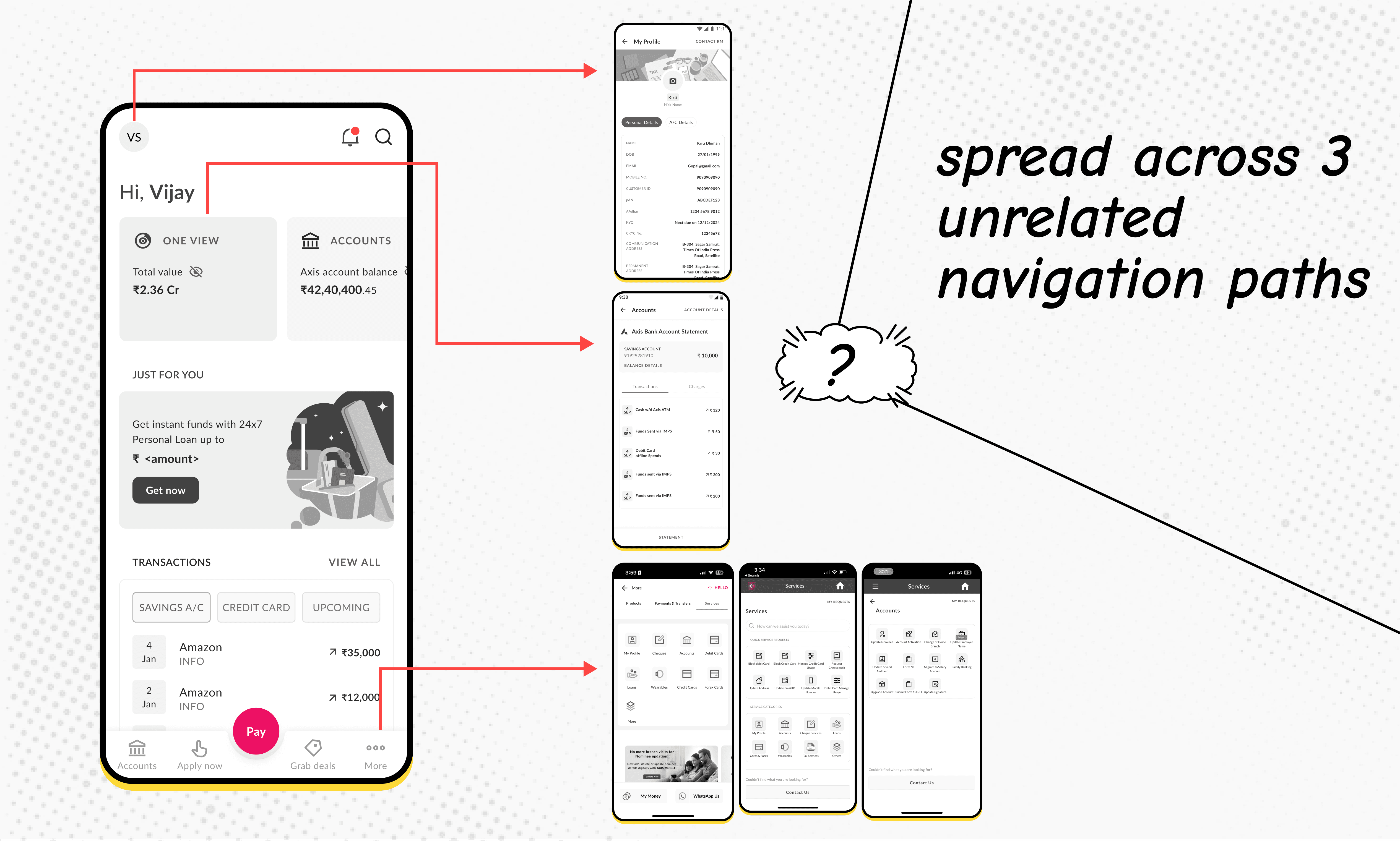
While working on adjacent flows, I noticed that everything related to a user's account — account info, service requests, and profile — was scattered across three unrelated paths in the app:
Account info → Accounts tab
Service requests → More > Services > Account Services
Profile → Dashboard > Profile
There was no single mental model for "where do I go to manage my account" — users had to remember where a feature lived instead of what they wanted to do.
I ran a heuristic evaluation to confirm this wasn't just a personal nitpick, and pitched a revamp: consolidate everything account-related under one tab. The hypothesis was simple — reducing navigation hops should ease cognitive load, and likely reduce drop-off and support confusion tied to users not finding these features.
This wasn't a mandated business ask — I spotted the gap and proposed it myself.
Role: Led solo (self-initiated), worked with PM for buy-in and prioritization calls.
Process
Step 1: Mapping the scope
Before jumping into screens, I listed out every task a user might do related to their account — pulling from support flows, app IA, and existing user journeys, to avoid designing a narrow "accounts page" that missed real use cases.
I ran an affinity mapping exercise to cluster these into logical groups, then reviewed the grouping with my PM to sanity-check it against business priorities.
Initial 8 buckets: Statements, Balance, Details, Manage, Transfer, Account Benefits, Card Details, Needs Support.
Step 2: Consolidating into final IA
The 8 buckets went through a few rounds of restructuring before landing on 3 parent tabs, plus one persistent utility:
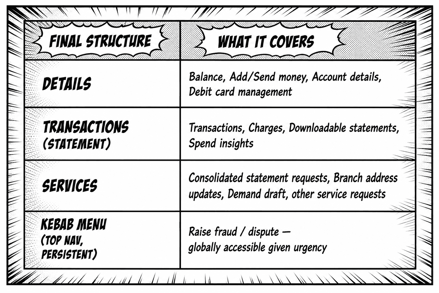
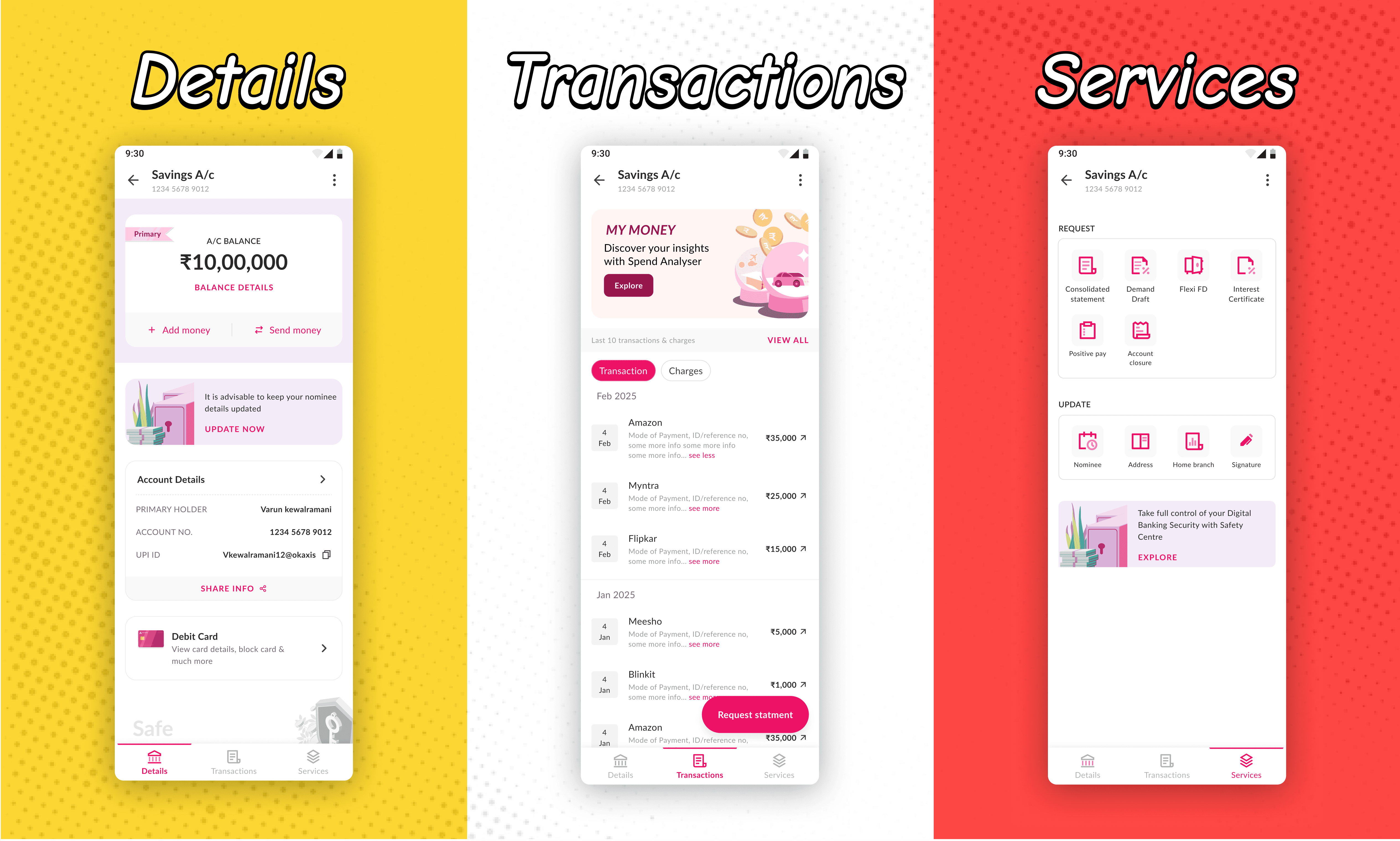
Rather than forcing a fixed number of categories upfront, I iterated until each bucket answered a clear "why would a user come here" question. It settled at 3: Details and Transactions split active-management from retrospective needs, and Services captured everything that required raising a request rather than an instant action.
Fraud/dispute reporting was pulled into a persistent kebab menu instead of being buried in a tab — time-sensitive tasks shouldn't require guessing which tab they live under.
I reviewed this with my PM for buy-in before moving to wireframes → hi-fi. Given this was self-initiated, I prioritized momentum over a formal validation round like a tree test at this stage.
Step 3: Wireframes → Hi-fi
Key Decisions & Trade-offs
1. Designing around legacy data (Privileges) While most account data could be pulled in live, "My Privileges" relied on a legacy system not ready for this release.
Original idea: Show Privileges as a fully live section alongside Debit Card details.
What shipped: Scoped to Phase 2 — kept as a card/entry point in the UI to preserve the IA and user mental model, without blocking launch on a legacy integration. Phase 2 is scoped but not yet shipped.
Why it works: Avoids redesigning the IA later; decouples slow/non-critical data from the main page load.
2. Dual entry point for statement requests Statement requests appear both as a persistent FAB on Transactions and under Services > Request.
Reasoning: High-frequency task tied closely to "I'm looking at my transactions right now" — burying it one level under Services would add friction for the most common case. Services still hosts it for users navigating there directly & also that's where they can access consolidated statements as well (Across different accounts).
3. Fraud/dispute as a persistent kebab menu Pulled out of the tabbed IA entirely and made globally accessible — low-frequency but high-urgency tasks shouldn't require guessing which tab they're under.
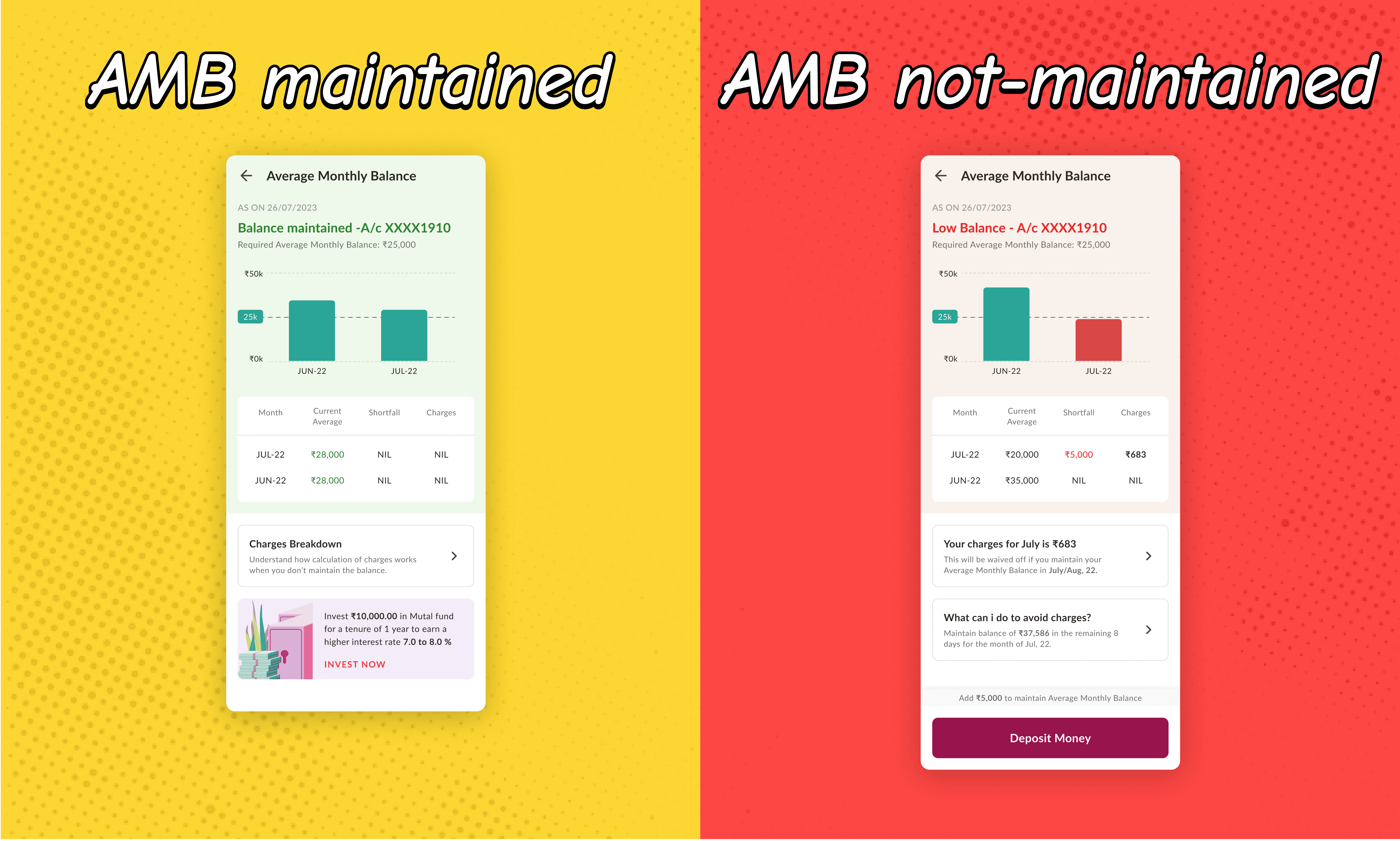
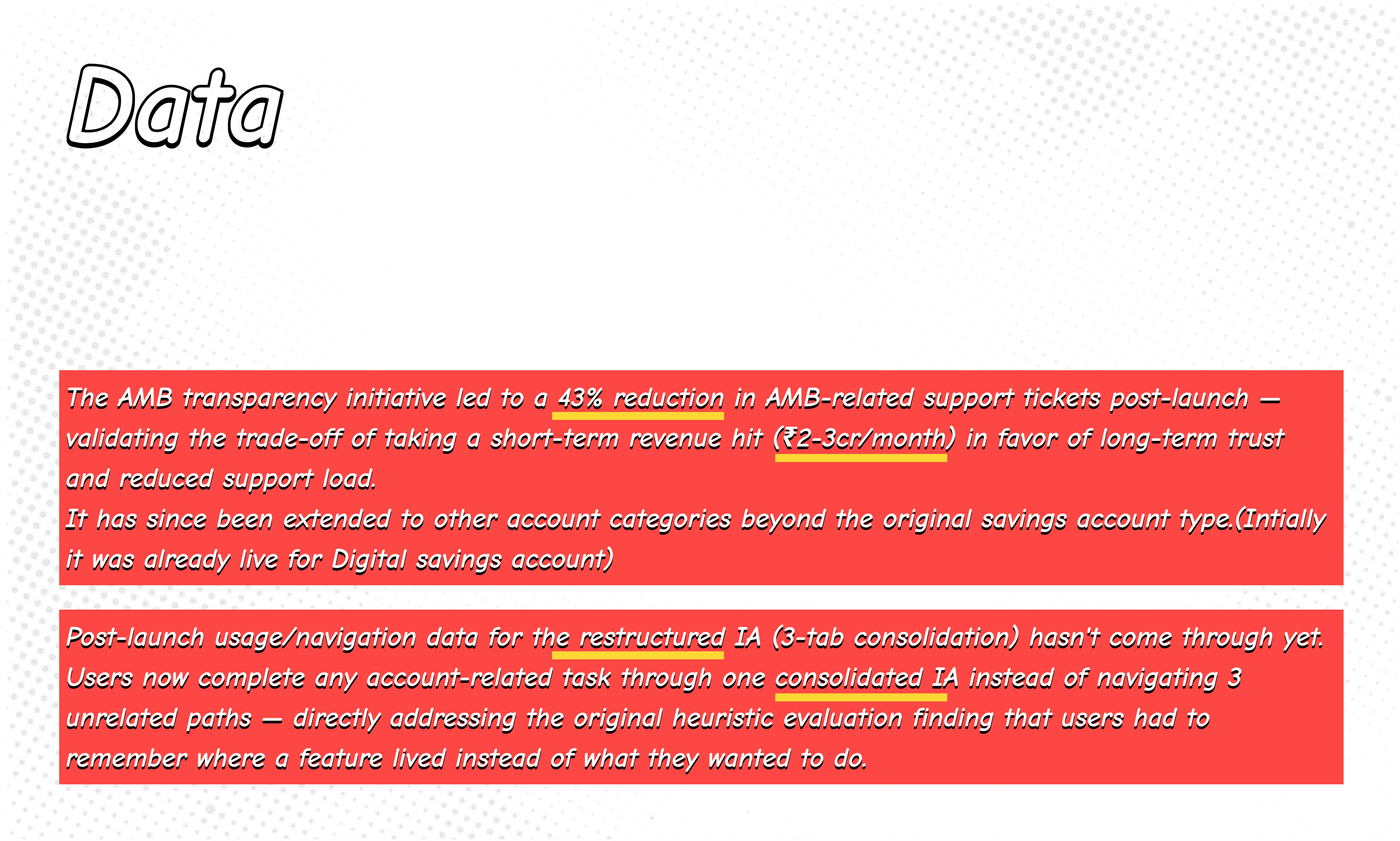
4. Showing Average Monthly Balance (AMB) transparently — choosing trust over short-term revenue Every month, the team was seeing roughly 200-250 customer support tickets from users confused about why AMB-related charges were being deducted — a friction point that also ate into the support team's time. This isn't a one-off internal issue either — AMB-related penalty confusion is a well-documented, industry-wide pain point that regulators have flagged repeatedly as a recurring source of customer complaints in Indian banking.
The trade-off: Proactively showing users their AMB — how it's calculated, what happens if it's not maintained for 2 consecutive months, and the exact charge they'd incur — was projected to cost the business ₹2-3 crore/month in foregone penalty revenue, since informed users could act to avoid the charge entirely.
The decision: Went ahead anyway, guided by the team's 3E principle — Experience, Empathy, Education. The reasoning: a transparent, educational experience builds long-term trust, even at a direct short-term revenue cost.
Why it works: This reframes the AMB screen from "we're charging you" to "here's how to avoid this charge" — shifting the relationship from punitive to informative.
Result: Given the drop in confusion-driven tickets, this pattern is now being extended to other account categories beyond the original savings account type it launched with — a sign the approach worked well enough to scale.
5. Primary account tagging for multi-account users Users with multiple accounts had no way to identify which one was set as "primary" — leading to confusion during auto-debits and manual payments, and in some cases, money being debited from the wrong account entirely.
The decision: Introduced a clear primary account tag/marker, visible wherever account selection happens (auto-debit setup, payments, etc.).
Why it works: A small, low-effort visual change directly reduced a real, costly error (wrong-account debits) — a good example of how not every meaningful fix needs to be a large feature. Outcome.The revamped Accounts section shipped to all users, consolidating 3 disconnected paths (Accounts tab, More > Services, Dashboard > Profile) into a single, intent-based structure across Details, Transactions, and Services.
Reflection
What I'd do differently: Given more time, I'd have run a lightweight validation step (like a tree test) on the final IA before high-fidelity design — I moved on PM buy-in and design judgment instead, which worked, but formal validation would have de-risked the structure further.