From "No Way to Give Feedback" to Dark Mode, Tokens, and a Component Library
Product design
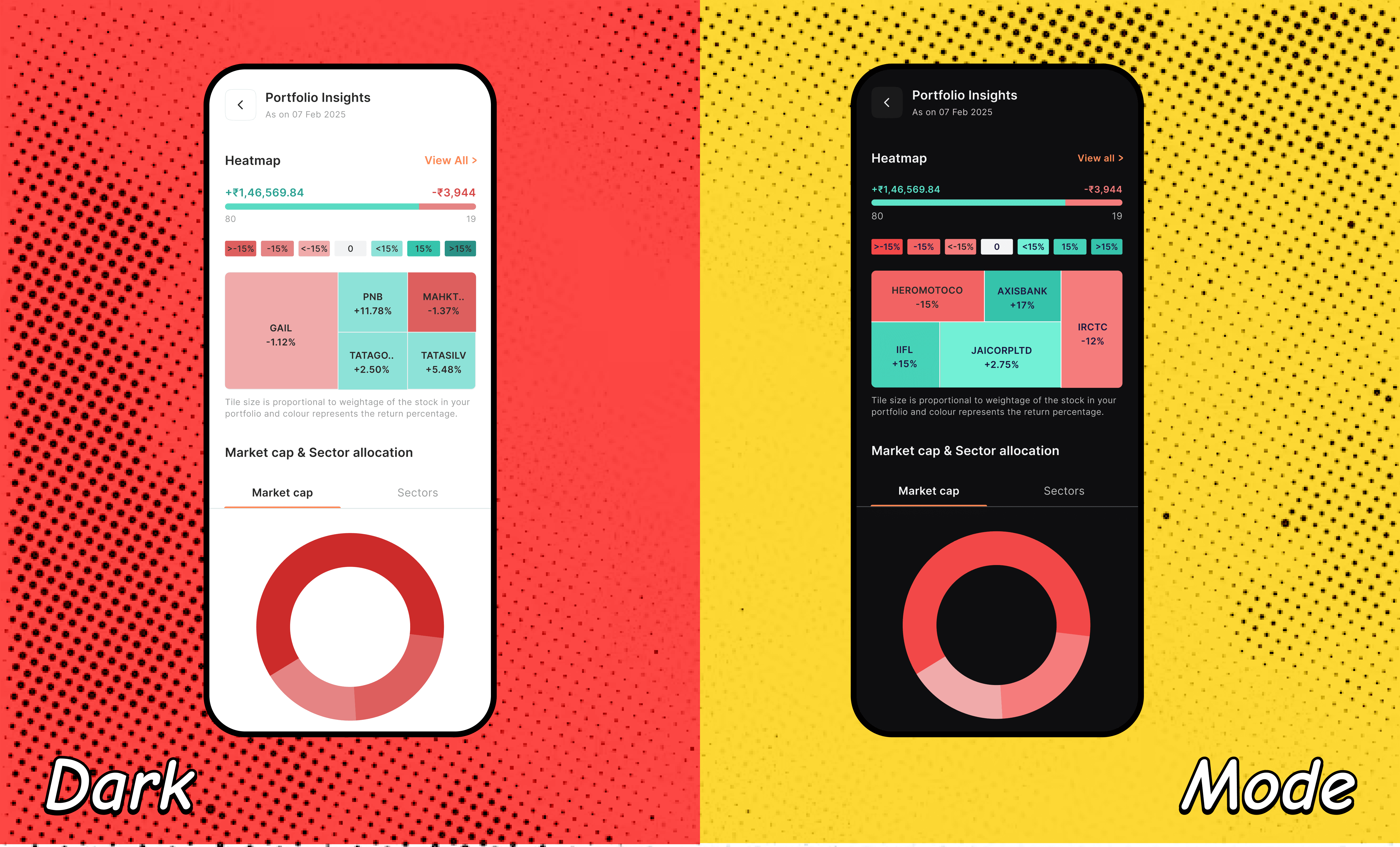
What started as a simple feedback touchpoint (because users had no direct way to tell us anything) uncovered two big asks — Dark Mode and a cleaner, more discoverable web experience. Fixing both led to something bigger: design tokenization across app & web, now being pushed further into WCAG-compliant color systems and a full component library.

Context
There was no direct way for users to give us feedback on the platform (app or web). I set up a lightweight touchpoint (using Tally) and placed it on app & web, so users finally had a channel to tell us what wasn't working.
The responses converged on 3 major, connected asks:
Dark Mode — for a stock trading platform, this isn't a cosmetic preference. Traders often have screens open for hours at a stretch, tracking charts and price movement, eye strain and screen fatigue are real, practical concerns, not aesthetic ones.
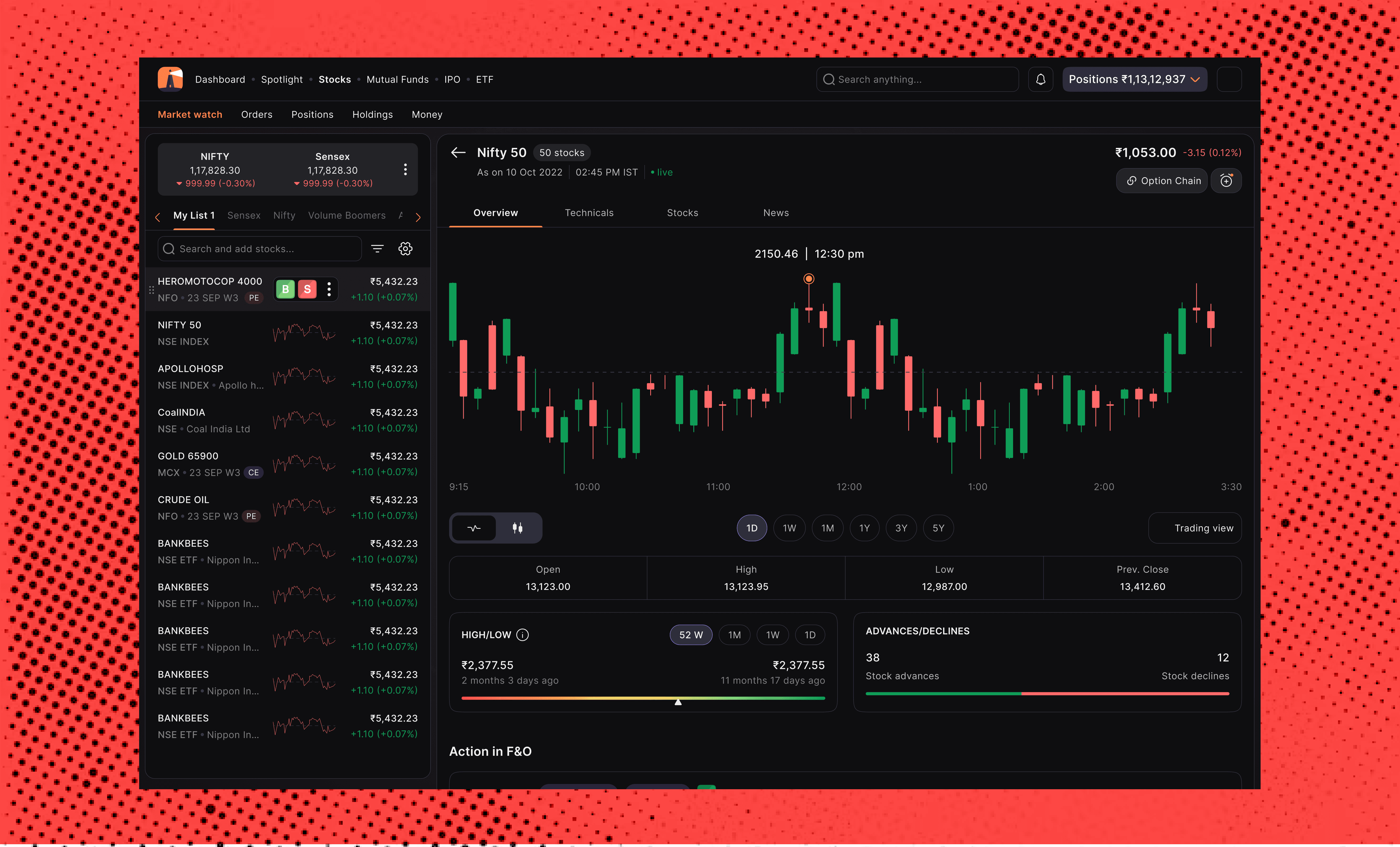
Fun Fact: Dark mode in trading has always been live since 1982, so we ofcourse were kinda wayyyyy behind.A cleaner, more discoverable web experience — both users and stakeholders flagged that the web UI can accomodate more data. On a platform where users are making time-sensitive decisions, discoverability isn't a nice-to-have; it's directly tied to whether someone can act on information fast enough. This eventually grew into a full overhaul of the entire web experience, not just the pages that prompted the original feedback.
No design tokens across app & web — this one wasn't a direct user ask, it surfaced while scoping how to actually deliver dark mode. Without tokens, every visual change had to be manually applied across every relevant screen, on both platforms, slow, error-prone, and risky on a live financial product.
Role
Led design solo across all 3 workstreams, working in close, day-to-day coordination with 2 frontend developers over a 6-month period. Ownership didn't end at handoff, I was also responsible for thorough post-handoff testing of every implementation, since there was no separate QA/testing function for this; the design team's ownership extended through to verifying the shipped result matched intent. The three problems were addressed in overlapping phases, rolled out across multiple sprints rather than a single launch.
Constraints
Legacy codebase risk: the existing code wasn't cleanly structured, changing certain components to introduce tokens had unintended ripple effects on other, seemingly unrelated screens. This wasn't predictable pushback from devs; it was a real technical landmine that had to be navigated carefully, screen by screen.
Live platform, real users, real money: unlike a lot of consumer-app redesigns, mistakes here have direct financial-trust implications, this shaped a more cautious, phased rollout rather than one big launch.
Solo design ownership across 3 concurrent workstreams, requiring close day-to-day coordination with engineering rather than handing off a finished spec.
Process
1. Building the listening channel first Before touching any UI, I got a real feedback loop in place, a Tally form placed on both app and web. This wasn't a research project; it was infrastructure. The 3 core problems came out of a combination of response volume (what came up repeatedly) and reading the qualitative detail behind those responses (why it mattered to users).
2. Realizing dark mode meant rebuilding the foundation first Scoping dark mode honestly meant asking: how do we change appearance across two platforms without manually touching every screen? The answer was tokens, text and color tokens, specifically, which had never existed for this product. This is the moment the project scope grew from "ship 2 requested features" to "build the system underneath them properly."
3. Navigating legacy code risk directly Rather than a clean, linear rollout, execution meant working screen-by-screen with the frontend devs, since introducing tokens on the existing (poorly structured) codebase caused unintended effects elsewhere more than once. This shaped the decision to roll out in overlapping phases across multiple sprints instead of a single big-bang launch, safer for a live financial platform, even though it meant a longer overall timeline.
4. Fixing web UI basics in parallel, prioritized by data, scaled to the entire platform Alongside tokenization, addressed the web discoverability problem — making content and data more concise, cleaner, and easier to locate. Rather than picking pages to fix arbitrarily, I used traffic data to prioritize: most-visited pages first, then worked down to lower-traffic pages. What started as fixing the highest-impact pages eventually covered the entire web platform, every page went through the same discoverability and clarity pass, not just the ones that prompted the original feedback.
5. Building a plugin to help the wider team adapt Beyond the core 3-problem scope, I built a plugin that lets any legacy screen have its old, hardcoded values replaced with the new tokens, meaning the rest of the team (not just the 2 devs I worked directly with) could adopt the token system on their own screens going forward, rather than needing me involved in every migration.
6. Owning quality through post-handoff testing Design handoff wasn't the finish line, since there was no dedicated QA function covering this work, I took on thorough testing of every implementation myself after developers built it, checking the shipped result against design intent before it was considered done. On a live financial platform, letting small implementation gaps slip through wasn't a risk worth taking just because "testing" technically fell outside a traditional design scope.
Key Decisions & Trade-offs
1. Choosing to fix the foundation, not just the 2 requested features Could have shipped dark mode and web-UI fixes without tokens, faster. Chose the slower, structurally sound path instead, because doing it without tokens would have meant repeating the same manual, error-prone work for every future visual change.
2. Phased, overlapping rollout instead of one launch Given the legacy code risk, committing to a single big launch would have meant a much higher chance of unintended breakage on a live trading platform. Choosing to roll out in overlapping phases across sprints traded a faster finish line for lower risk to real users' trust in the platform.
3. Building the plugin, Wasn't asked for, but recognizing that 2 developers manually applying tokens wasn't scalable to the rest of the team, I built a tool to make future adoption self-serve, a decision about long-term system health, not just this project's deadline.
4. What I'd let go of The timeline wasn't a clean, sequential rollout as originally hoped (Dark Mode → Web UI → Tokens) in practice, work overlapped and had to adapt around what the legacy codebase allowed at any given point. I let go of a tidy, linear narrative in favor of what was actually safe to ship incrementally.
5. Prioritizing web fixes by traffic, not by guesswork With a long list of pages needing cleanup, I used traffic data to sequence the work fixing the most-visited pages first, then working down to lower-traffic ones. This meant the impact of the fix reached the largest share of users as early as possible in the rollout, rather than spending equal effort on high- and low-traffic pages alike.
Outcome
45-60% reduction in developer time for visual/style changes post-tokenization, changes that previously required touching multiple screens manually could now be made at the token level, and in many cases at the pre-prod stage too without needing a lot of back-and-forth with a developer at all.
All 3 user-requested outcomes (dark mode, cleaner/more discoverable web UI, and the underlying token system) shipped within the 6-month window.
The plugin extended the impact beyond this project — enabling the wider team to migrate legacy screens to the token system independently.
No Major web usuability related complaints since (April'26)
Further trackingDark mode adoption rate among active users - Since team didn't have firebase installed, I recently got it embedded to track the usage.
Reflection
The biggest lesson here was that "what users ask for" and "what actually needs to be built" aren't always the same thing, dark mode was the visible ask, but delivering it properly meant building something invisible to users (tokens) that ended up mattering more, both for velocity and for consistency across the platform.
The legacy code risk was the hardest part to navigate, and if I were to do this again, I'd want to audit and map component dependencies before starting the token rollout, rather than discovering unintended side-effects screen-by-screen as we went. It worked out, but a lightweight dependency audit up front likely would have caught some of these issues earlier and made the phased rollout even smoother or rather faster since the current testing took a fair chunk of time.
Next Steps
Tokens solved consistency at the style level color, typography, spacing. The natural next step is solving it at the component level: building out a proper component library on top of the token foundation already in place.
This is a direct continuation of the same thinking that drove the tokenization work — just as tokens meant a color change didn't require touching every screen manually, a component library means a button, input, or card only needs to be built and fixed once, instead of every team re-solving (and re-styling) the same UI patterns independently across the product.(We already face this issue with our calendar and bottom sheet inconsistencies)
It also connects directly to the accessibility work now underway (WCAG-compliant tokens) , building that rigor directly into shared components means every team gets accessible-by-default UI, rather than needing to individually verify compliance every time they build something new.
Common Questions You Might Get
What was the hardest part of this project?
The legacy codebase's hidden dependencies nothing was as isolated as it looked, so every change needed screen-by-screen verification. This is also why I stayed hands-on through testing, not just handoff.How did you define dark mode colors?
Started from the light-mode brand palette and used an AI tool to generate a first-pass dark adaptation across the token set, fast, but not the final answer. Went through it manually after, fixing colors that technically matched but didn't hold up in context, too saturated on black, poor contrast, or visually fatiguing. Gain/loss (green/red) got the most attention, since those two colors carry the most critical information on a trading screen. Later formalized against WCAG as part of the broader accessibility push.How did you define the tokens?
Started from Axis Bank's open-source design system rather than building from a blank page, and tweaked it for Ventura's needs. Token architecture is a well-solved problem — starting from a proven system let me spend my time on what was actually unique to us: trading-specific semantic colors and adapting it to our legacy codebase.Why start with a feedback form instead of formal user research?
Speed. No channel existed at all, so getting any real signal fast mattered more than a perfect study. It became permanent listening infrastructure, not a one-off.Why tackle tokens when nobody explicitly asked for them?
Users asked for dark mode; tokens were the only way to deliver it across two platforms without repeating slow, manual work for every future change.Why a phased rollout instead of one big launch?
On a live trading platform, a single launch was too risky; phasing traded speed for safety.How did you measure success without a dedicated QA or research team?
Owned testing personally post-handoff. For impact: 45-60% reduction in developer time on style changes, directly observable in how much faster (and less dev-dependent) changes became. Also feedback from the fellow design & dev team members.What would you do differently?
Map component dependencies in the legacy code before starting, instead of discovering side-effects as we went.